
“Strong Is My Beautiful” is a call-to-action; an identity-defining mindset claimed with honour. It’s also the name of a fitness and lifestyle brand with a mission focusing on positivity, strength and empowerment,

The branding for “Strong Is My Beautiful” embraces the concept of duality — feminine/masculine, soft/hard — in the context of boxers and athletes.
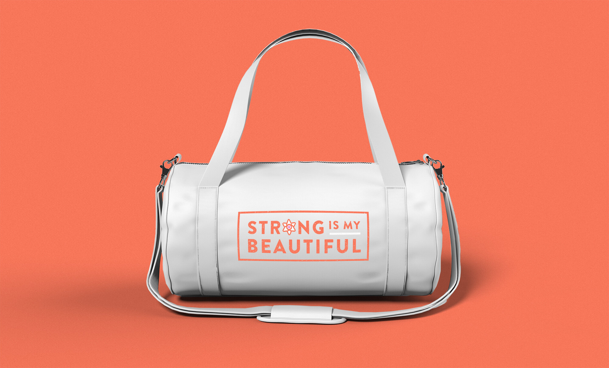
This unity of contrasting forces was expressed in the style and colour palette — bold font, bright colours paired with more subtle tones, smooth lines and gritty textures.
Similar to how a coat of arms denotes family descent and customized NASA patches distinguishes specific missions, the full logo mark is contained in a solid shape, designed in a badge-style to express proudly claiming and displaying one’s identity.
Full of symbolism, much like heraldic emblems, a boxing glove is held aloft like a hand fisted in solidarity. A single gladiolus bloom is clutched which is a symbol of strength and solidarity.

Role: Creative Direction, Design
Client: Strong Is My Beautiful
Scope: Logo, Branding